|
|
|
Selection of pots for bonsai-growing - sizes and shapes of pots
 At the beginning of our bonsai pots mini-series, we get to make a fundamental
decision. The decision is correct SIZE AND SHAPE.
At the beginning of our bonsai pots mini-series, we get to make a fundamental
decision. The decision is correct SIZE AND SHAPE.
These will be exhibition trees and not trees at the beginning
of their growing, when the pot size is significantly subordinated to growing
possibilities. For definite pot, its acceptable height equals the trunk diameter
at the foot. Its length should approximately equal 2/3 of the tree height.
These rules are for information only. No strict observance of such rules is
required but it is good to know about them.
There are growing styles, which are totally outside these rules.
They are, for example, cascades, semi-cascades, landscapes, woodlets and
groups. Here, the grower intentionally uses very deep pots or very
shallow ones; a plain flat stone is often enough.
What is decisive is the effort to induce an environment in which the trees are
naturally growing. For the cascades and semi-cascades, the very
deep pot represents a dramatic rocky and scarp landscape. The pot height is a
composition support to start playing the wonderful cascade "waterfall".
Creating landscapes, woodlets and groups is the exact opposite
to the cascades. Here, the viewer does not look at one tree only but can see
more of the nature. The landscape impression can be brought about by a very low
pot, which is hardly visible and which allows the viewer to "come inside" the space.
In this case, a relatively wide pot should be selected to create a wood or landscape
perspective.
 On the other hand, narrow pots can be used for groups.
The main goal is not depicting depth but larger detail.
On the other hand, narrow pots can be used for groups.
The main goal is not depicting depth but larger detail.
When selecting a bonsai pot, we should first know what character and form our tree
has. The basic guide is a definition of the so-called OPTICAL WEIGHT
of the plant. The weight is given by its shape. We assess how it affects us as a complex.
If the tree has a massive impression expressing power, majesty and strength, if the tree
trunk is thick and strong with gross rhytidome and forked branches, it will require
another type of pot than slim, delicate tree with fine branches, round crown and smooth
trunk. Generally, decidious trees have less optical weight than permanently green conifer
trees. They are considerably lighter, paler and more cheerful than the conifer trees.
On the other hand, conifer trees emit peace, stability and seriousness. They have a
rougher and more massive look. The pot must have the same properties as the tree.
Should we want to pick it up more easily, the decidious trees can be kept in oval pots
and the conifer trees in angular pots. But just as each person has a different character,
the same can be said for flowers and plants. Each plant has its own suitable pot.
Therefore, there are many transient shapes, The basic, optically heavy
shape is lightened in many ways.
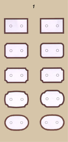
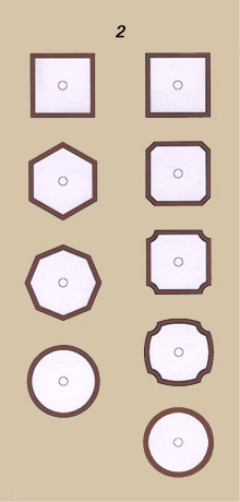
Figure 1 depicts how the pot's optical weight decreases when looking from above. This
phenomenom is given by shrinking of the edges and rounding and softening of the contour
line. At the top, there is a default strict rectangle reduced "in weight" when going down
the image. The resulting and sensually the lighest shape is oval. The same can apply for
square to circle, see figure 2. Each of the forms has its own "weight category".
The side boundary of the pot plays an important role as well. When
looking at the pots from the side, we can perceive different weight levels. Lightweight
shapes can be achieved using several methods:
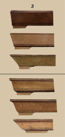
REDUCTION OF THE FOUNDATION SIZE
The smaller the pot foundation size, the less sturdy is. Figure 3 shows successive
reduction in weight of two shape types, always from the top down. The form looks
lighter and lighter. The lowest plots are almost dishes. They could form a
harmonic complex with a plant with a thin, fragile up to playful trunk.
CLOSING THE SHAPE
Noticeable reduction of optical weight is achieved by rounding and closing the upper
pot line. A very open shape, see fig. 4, accepts the most substance. It becomes lighter
with the closing. It is best to place bonsais with light thin trunks in pots very rounded
inwards.
SHIFTING CENTER OF GRAVITY UPWARDS
The effect of lightening occurs when the center of gravity moves from the lower to
upper part of the pot. The pot does not appear to sit heavily in its bowl. The shape
is more intensive and elegant.
OPTICAL LOWERING
The more the pot islowered, the lighter it sensually is. The pot height can be
optically lowered using horizontal division. The repeating parallel lines
extend the shape to the direction in which they are led. The lower the pot as
well. For vertical lines - e.g. on cascades - slimming occurs. This is caused
by using various strips, bands, cartouches, grooves and chutes.
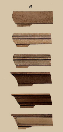
RIM EFFECT TO THE POT CHARACTER
Successive emphasizing of the pot rim increases visual weight. Figure 7 depicts
two trios of basic shapes. The upper three pots are open and the lower three
pots represent the closed type of pots. One can see how their optical weight
grows at the moment of strengthening the rim.
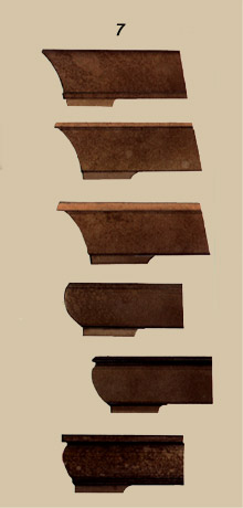
EFFECT OF LEGS ON POT WEIGHT
Pot legs play a certain role when characterizing a pot. For example, fixing of
the legs is important. They lighten the pot by being fixed under the basic shape
- see figure 8. The heaviest option is at the top - the legs are aligned with
the pot outline.
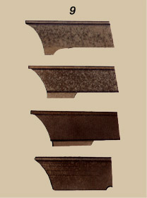 The length and height of the legs is important as well. The longer and lower, the better feeling of weight and
stability (figure 9).
The length and height of the legs is important as well. The longer and lower, the better feeling of weight and
stability (figure 9).
The nature of the pot is completed by various artistic realizations of the
legs. Heavier trees require heavier pots and easily-shaped legs. A growing
impression of bonsai lightness and elegance may increase the complexity of the legs
of the pot. Through their playfulness, richness and sophistication, they lighten
the overal work composition.
Colour of the pot
In this article, we shall discuss the selection of a correct colour for bonsai pots.
As was already mentioned above, the tree and the pot form a complex. As
for shape and colour, their relation must be harmonic. Excellence can be reached by
selection of a hue being in harmony with the tree colour, giving a true picture and
enhancing its character.
The colour has a decorative and psychological function. The grower
looks for the same character features of the tree and the pot colour. Again, the
guide is the OPTICAL WEIGHT of the tree, which is given by its
shape.
Should the complex be sturdy, of massive impression, expressing power and majesty,
if the trunk is strong and thick with coarse rhytidome, the pot colour will be
darker, more serious and heavier than for slim to fragile trees, with fine branches
and smooth trunk. Generally, decidious trees have less optical weight than conifer
trees. The expression of leaves is more lively, lighter and cheery than a conifer
crown. For conifers, we respect their calm, stability and seriousness.
For information only, please see the table with recommended examples of
combinations of plants and pot surfaces.
| Table NO. 1 |
| Pot surface nature | Tree nature |
| dark, non-glazed, rye to coarse surface | optically heavy conifer, dramatic form |
| dark, non-glazed, smooth surface | conifer with lighter trunk |
| dark, matted glaze | conifer with lighter trunk |
| light, non-glazed, smoothed surface | optically heavy, decidiuous tree and conifer |
| lighter, matted glaze | exterior and interior decidious trees and decidious conifers |
| bright glaze | evergreen plants with bright leaves, attractively coloured leaves or blooms |
|
For colours, we distinguish BRIGHTNESS AND SATURATION. Saturation
expresses its power and intensity.
The brightness (or value) defines location of the colour on a darkness scale
from white to black.
In bonsai creations, we shall use refracted saturated colours
very carefully. The pot colour may not distract the eye from the tree or dissipate
the overal atmosphere. The same shall apply to the brightness quality of hues.
The more noticeable a tree is as for colour, the more intensively coloured a pot
may be.
To avoid monotony in the tree-pot relation, I recommend using
lighter, more saturated colour hues for the pot.
More intensive colouring is selected for plants in bloom, of intensively coloured
leaves or fruits or for some minature bonsai (MAME), where the pot area is too small
and such minor composition requires some attractive points.
Colour harmony can be achieved in two ways: colour resemblance or colour contrast.
SELECTION OF POTS ACCORDING TO COLOUR RESEMBLANCE
This is the most common method of the creative approach. A bonsai grower searches for
a pot colour similar to the crown or tree trunk hue colours. They mostly come from the
colour of the trunk.
We cannot automatically say that trees have brown trunks only. A sensitive observer can find
many grey, violet, ochre and other hues. The trunk colour diffuses from the branches to the crown,
which results in perfect interconnection of similar pot hues with the trunk and the bonsai crown
too.
It is necessary to consider whether we should come from the colouring of the leaves or
needles only. For trees with rich green crown substance, drabness occur when placed in a pot
of the same colour. The leaf surface is mainly green hued and there would be too much green.
When selecting a pot, we should look for grey-green, grey-blue, yellow-green or silver shades
that are less represented.
SELECTION OF POTS ACCORDING TO COLOUR CONTRAST
Now we are setting out on a more difficult journey to find colour harmony.
The goal is not to find a similar hue to the existing one but to create harmony between two
totally different colours.
In bonsai practice, we use this in case trees with very striking leaf colours
(e.g. Japanese maples), blooms or fruits. To complement this hue system, we are looking
for a pot colour which will enhance their typical colouring. We will use colour not only
for decorative but also for psychological reasons. We will highlight that part of the
tree which best expresses this.
 In history, many physicists, chemists, philosophers and artists dealt with the
science of colour . We can name famous persons such as Newton, Ostwald, Delacroix,
Itten, Klee and even Goethe, who wrote his Farbenlehre in 1810. There is a lot to
follow up. The most successful was Ostwald´s classification of colours in the
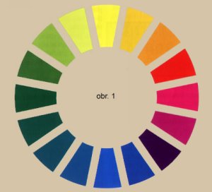
colour circle, see figure 1.
In history, many physicists, chemists, philosophers and artists dealt with the
science of colour . We can name famous persons such as Newton, Ostwald, Delacroix,
Itten, Klee and even Goethe, who wrote his Farbenlehre in 1810. There is a lot to
follow up. The most successful was Ostwald´s classification of colours in the
colour circle, see figure 1.
This comes from spectral colours, which are generated by the
breaking up of sunshine using a glass prism (a rainbow in nature). We distinguish
three basic colours - yellow, blue and red, and three colours derived by mixing
them: green, orange and violet. All the colours are listed to smoothly blend from
one to the next.
Based on the colour contrast, harmony is achieved by selecting
colour pairs lying on opposite sides of the circle. This means: red - green, yellow
- blue, orange - blue-green, yellow-green - violet. We call them complementary
colours.
According to the simultaneous contrast law, two complementary
colours laid next to each other have the effect that each accepts a part of the
other one and they both create an enhancing pair. We call this phenomenon the
addition of colours. Its practical use can be seen in the following table 2.
| Table NO. 2 |
| Tree character | Glaze colour |
| red leaves of Japanese maple | green-blue glaze |
| apple tree with red fruits | green glaze |
| cotoneaster with orange fruit | glue-green glaze |
| yellow leaves of Japanese maple | refracted blue glaze |
| light violet blooms of wisteria | light yellow-green refracted glaze |
| hawthorn with red blooms | green glaze |
| yellow blooms of cinquefoil | blue glaze |
In bonsai art, we will not use colours in their pure form as can be seen in the
Ostwald circle. We will reduce their intensity adequately to the colour saturation
of the tree for which the pot is intended. In painting, this is achieved by
successive addition of grey.
When looking for suitable combinations of complementary colours, one cannot proceed
with geometrical precision. The individual sensual approach of each grower is very
important. Colour perception needs to be developed. Creative individuals search
for inspiration in nature, at fairs or in literature.
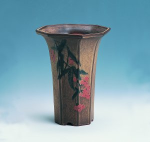
Figure 2:
Beautiful example of sensitive selection of pot colour based on colour resemblance.
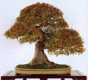
Figure 3:
Example of harmony based on colour contrast. The yellow-orange leaves are enhanced by a blue pot.
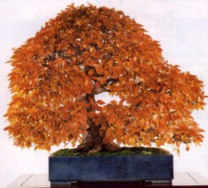
The photos were taken from Bonsai Art magazine.
I hope your efforts to create beauty help you on your path to harmony.
Decorated bonsai pots
 If we are thinking about selection of pot for a given bonsai, consideration
on the suitability of decorative elements on the pot is very important.
If we are thinking about selection of pot for a given bonsai, consideration
on the suitability of decorative elements on the pot is very important.
Let´s avoid too striking a decoration which distracts from the plant. First of all,
the pot should fulfil its function - creating space for roots, their protection,
providing moisture, nutrients and last but not least creating the atmosphere of the
natural environment typical for a specific plant. A well selected bonsai pot has
its decorative value even without decoration. We do not support autotelic
formal decoration. Some creations suffer the feeling of insufficiency when
looking at a simple clean shape with a beautiful surface. They are overcome by
the impulse to fill in the "empty" space from top to bottom, from left to right,
the more filling, the higher the price of the final product. It is probably what
remains in people's subconscious - the influence of historial pseudo-styles of the
19th century. The Gothic, Rennaisance and Baroque styles were admired. Frequent,
sometimes spiritless taking over of morphology and decorative elements led to
enrooting of the feeling in which desire for beauty and decoration are combined.
 Accelerating the life rhythm of the 20th century brings different aesthetical values.
Particularly functionality comes to the fore together with simple and useful shapes.
An ornament is the surface of cultural materials. Modern European design does not revel in an excess
of details. However, a different situation may exist in other, particularly Asian, countries, where
traditional life remains.
Accelerating the life rhythm of the 20th century brings different aesthetical values.
Particularly functionality comes to the fore together with simple and useful shapes.
An ornament is the surface of cultural materials. Modern European design does not revel in an excess
of details. However, a different situation may exist in other, particularly Asian, countries, where
traditional life remains.
The pleasing connection of old traditions with a modern understanding of aesthetics
can also be found in current Japan ceramics.
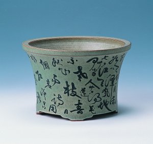
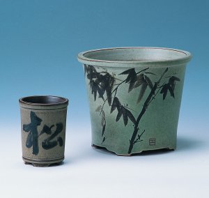
Décor is a graphic art solution in the are of containers. It can
be purely flat using graphical or painter´s means. This category includes grooving,
punching, one-colour painting using pen, brush, calligraphy or simply paints.
Relief decoration is traditional as well, which rather falls into the category
of sculpture.
 When chosing the décor, we should consider the harmony between the décor and the
character of the bonsai tree. Harmony must be achieved from the point of view of FORM
and CONTENTS.
When chosing the décor, we should consider the harmony between the décor and the
character of the bonsai tree. Harmony must be achieved from the point of view of FORM
and CONTENTS.
From the FORM point of view, we consider suitability of abstract
approach employing geometrical elements for the decoration (from simple area
division up to ornaments) and, more or less, naturalistic approach imitating a
part of nature. It depends on the creator not to be satisfied only by optical
description of reality. We can borrow some graphical elements (line, area,
structure, colour) from nature and creation is what is left on us based on own deep
experience.
Overall conception of the form of decoration is very important. We can move in wide
range: from fine graphical filigree expression up to robust, monumentally
penetrative expression.
 Fine, light linear drawing or painting will correspond well with bonsai of more
slim and elegant trunk. On the other hand, expressionally heavy and majesty tree
requires simple and more massive décor.
Fine, light linear drawing or painting will correspond well with bonsai of more
slim and elegant trunk. On the other hand, expressionally heavy and majesty tree
requires simple and more massive décor.
In general, each decoration adds some lightening to plant, takes some calm and
seriousness. This is why I am recommending consideration of its use in pots for
conifer trees. I am absolutely recommending maximum limitation of colours.
We should rather select sober ornament, engraving or drawing in darker softer hues.
The painter´s more strinking décor is best for pots for bonsais in blossom and for
bonsais with strinking fruits. It has wide application for complementary plants
intended for animation of a fair or for MAME category. Decorated
pots of these mini plants enhance feeling of playfulness and loveliness.
We can not forget to relation, which will create between the tree and
CONTENT ASPECT OF DECORATION. This is particularly apparent in work
of Chinese and Japanese painters. Their art is instincted with symbolism we must respect.
Calligraphy involves the same problem. The content of the text, although
illegible for the most of us, should be in harmony with the plant.
I urge to be prudent and restrained when using the decorated pots.
The decorative elements should only complement and animate the shape. Let´s use them
only in case when the creative intetion requires more lively, more distinct result than
offered by a smooth pot. It is better to have only a few pots with ornaments in your
collection. They are special and extraordinary and therefore we will accentuate their
aesthetical quality when selecting them for use. We should not be satisfied with
series décor, spouted in neverending lines lacking of its original idea. In most
cases, it is print or formal manner of engraved styles. Hoverver, out trees are worthy of
the best only.
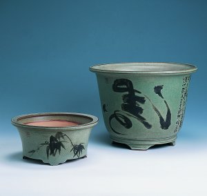
The pots figured out above have been created in KLIKA & KUŘÁTKOVÁ atelier. The author of the décors is TAJ-ŤÜN Hejzlarová.
|
|